Infographics
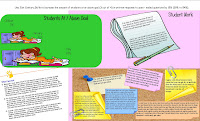
I have become obsessed with infographics. I have seen them popping up more and more frequently on Twitter, blogs, and articles. Last week, I tried to create an infographic for my end-of-year review. I had tons of information on it, and probably too much on there. For our summative review we need to include data, student work, and reflection.
Kinda pretty, in an elementary way, isn't it? But honestly, I didn't know what I was doing. I was more concerned about meeting all of the criteria for my summative review. Which this does, but not in a format that will be accepted. Yes ... I had to do it over in Word format.
Despite being told I had to do all of my work over, I decided to give infographics another go. Because I'm really not a data girl, I decided to create another one based on the data I had to collect. Which, in the long run was a good thing, because it helped me get re-focused on what I had said my goal was this year. Yes ... I went through the motions of the summative review process.
So over the foggy weekend, I hunkered down with my iPad and started searching for more info on infographics. It wasn't until searching through Cool Infographics, Wild Apricot, and Six Revisions (along with a few others) that I realized an infographic is truly no different than those full page elaborate diagrams in a magazine or informational text. Infographics typically include a visual representation of numerical information like timelines or graphs, and your conclusion of that information (Spyre Studios).
I sketched out what I wanted to include in my infographic and went from there. My sketch and my final result really look nothing alike. As I was creating my infographic I remembered that my professional goal was related to 21st Century Skills. In remembering, I realized that I had not included anything in any of my review about 21st Century Skills. So, I started to go through my blogs, and classroom Twitter feeds to gather more data. As you can see, I have much more data on this infographic accompanied by a couple of conclusions.
There are all kinds of Web2.0 tools that you can use to create charts, timelines and maps. But really, all I used was Excel. If I were to include a timeline, I certainly would use a Web2.0 tool. To create the graphic itself, I used Microsoft Publisher. I happen to enjoy Publisher, but for this particular medium, it has its limitations. However, Glogster, LinoIt, Prezi, and even a website or blog host could probably allow you to do the same. Now that I feel more confident in creating infographics, I look forward to using them in the classroom. Particularly, now that it is the end of the year it would be a great way for my visual-spatial kiddoes to reflect upon their school year or even tell their fourth grade teacher about themselves.


Comments
Post a Comment