Infographics In Math
Blogging is a norm in my classroom to learn and practice mathematical concepts. I find that engaging my students in realistic stories helps them construct their own meaning of third grade math. Lately, the stories have become more complex. About a week ago we worked on a problem around my co-teacher's recent wedding reception. The children had no problem applying the mathematics, but it was difficult for them to keep track of all of the information. I thought that infographics could be one tool they could use.
Throughout the year, I show my students how to break apart complex mathematical stories. Using a strategy from Comprehending Math, I show them how to read the problem and determine what they know (K), what the want to know (W), and what conditions there are (C). Over the years I have used a KWC chart, and have also shown the children how to underline what they know, circle what they want to know and highlight/box the conditions. This typically works when what they want to know and/or the conditions are limited to one thing.
Back to the wedding favor post...
As I conferred with my students I noticed they were not struggling with the math at all. I was confident in their abilities to solve the entire problem. Yet, as I was looking back at their comments on the blog I realized that they when they went to respond they were missing chunks of their answers. I decided that infographics would be a good way to meet a variety of their needs. That night I took the post, broke it apart and created an infographic to model the process for them.
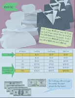
 Using the picture from the blog post, I highlighted the condition with a green arrow to show that we had to spend less than $500. Next, I created the table that would be helpful in solving one part of the problem. I highlighted how much it would cost to make one favor and added a note next to it explaining what I was showing. Then I highlighted how much money would be spent in all and how many favors would be bought in all. Again, I included a note explaining what that was showing. Another part of the problem requested to know how the favors would be paid for in exact cash. I included the money and a speech bubble explaining what it was showing. In the end, I included a post-it note on the picture to pull all of that together in a few sentences, explaining the entire infographic.
 The end result? Some of them were really jazzed about the idea, while others not so much. Some of them tried this with the next problem about baseball gear. My baseball fanatics were happy because they drew a baseball field. Quite creatively, they decided that they would label the position with the corresponding dollar amount. For example the item that cost $4 would go on second base and the item that cost $8 went in center field. They used one dugout to hold the conditions and then another to host the table that would help them calculate. A couple of them swore that they would never do an infographic again, but they would now start using a table instead. All good, because I really just want them to find a tool that works for them and use it!

Comments
Post a Comment